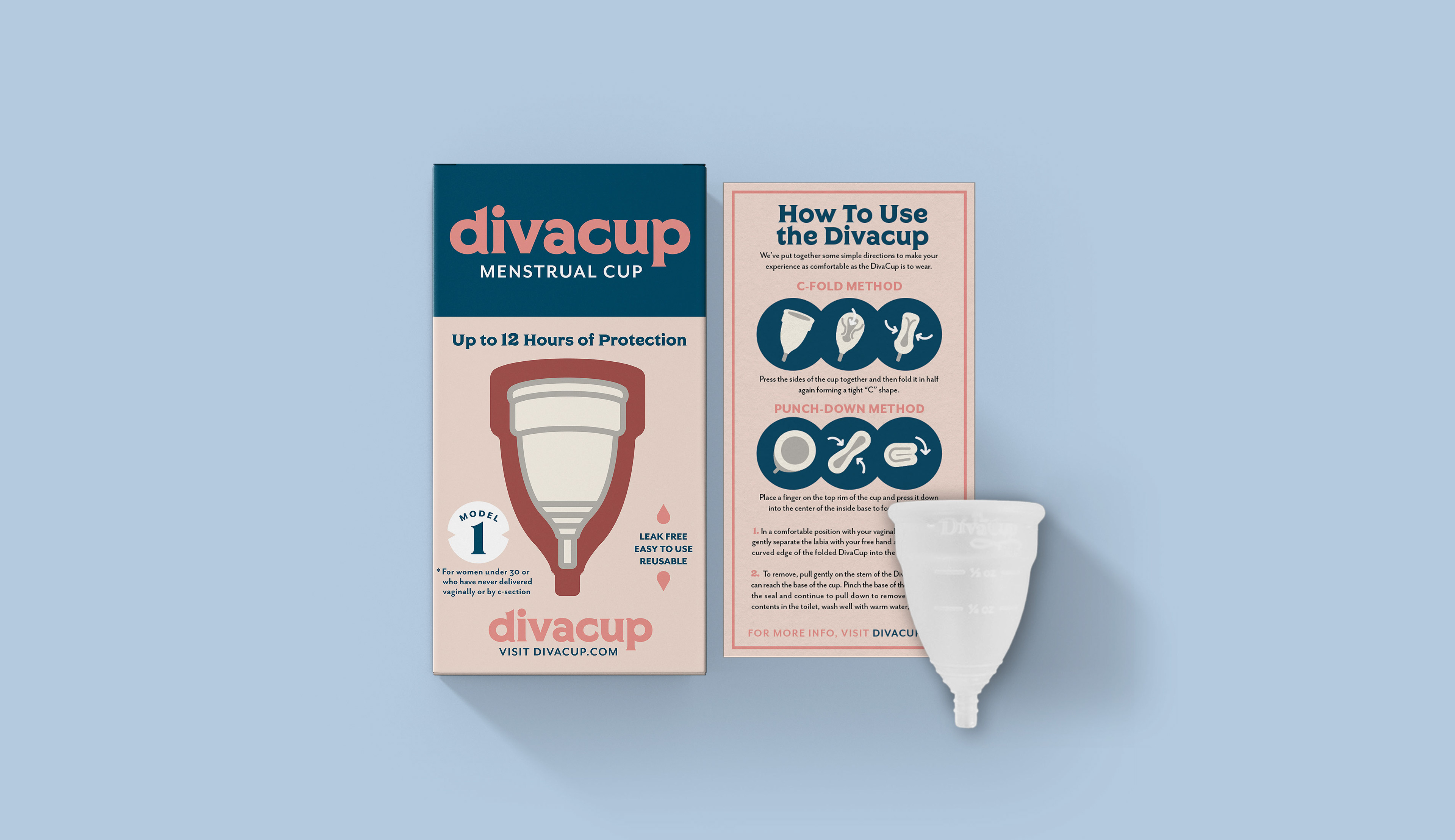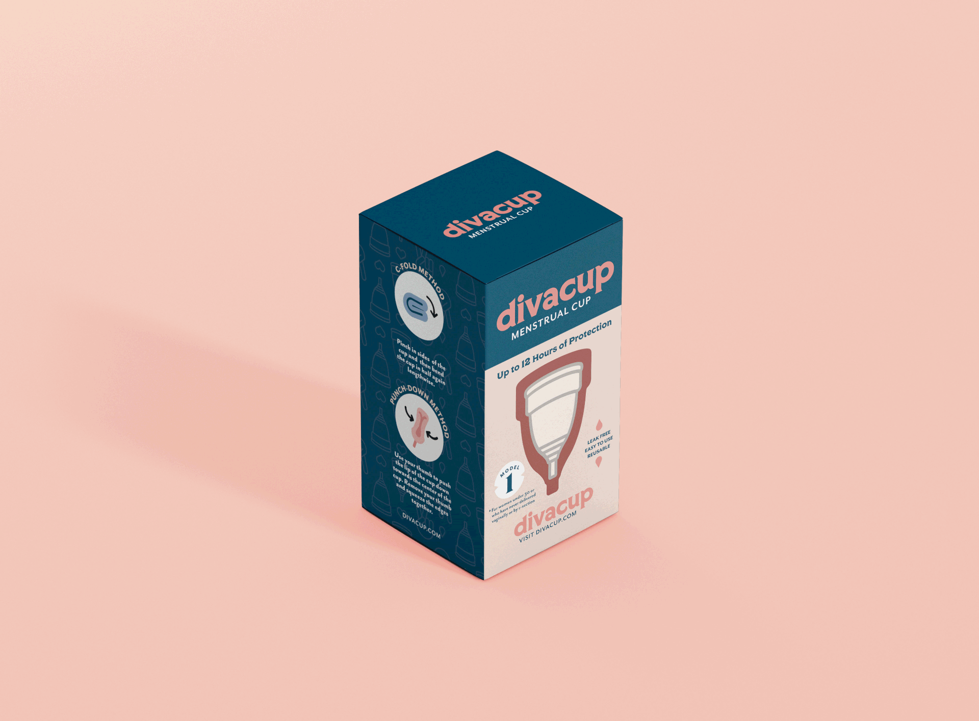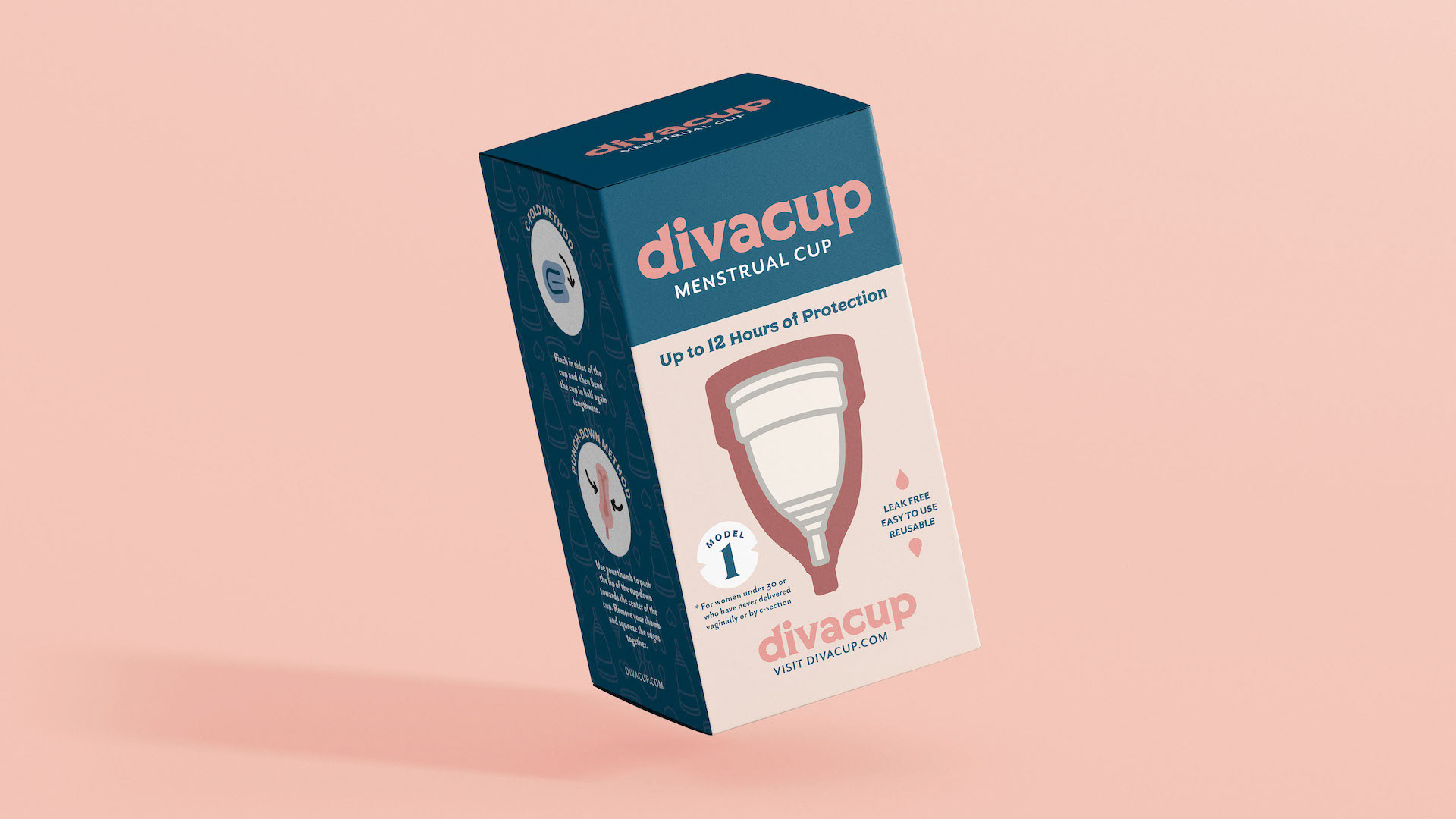
☛ D I V A C U P
Branding ✧ Packaging Design
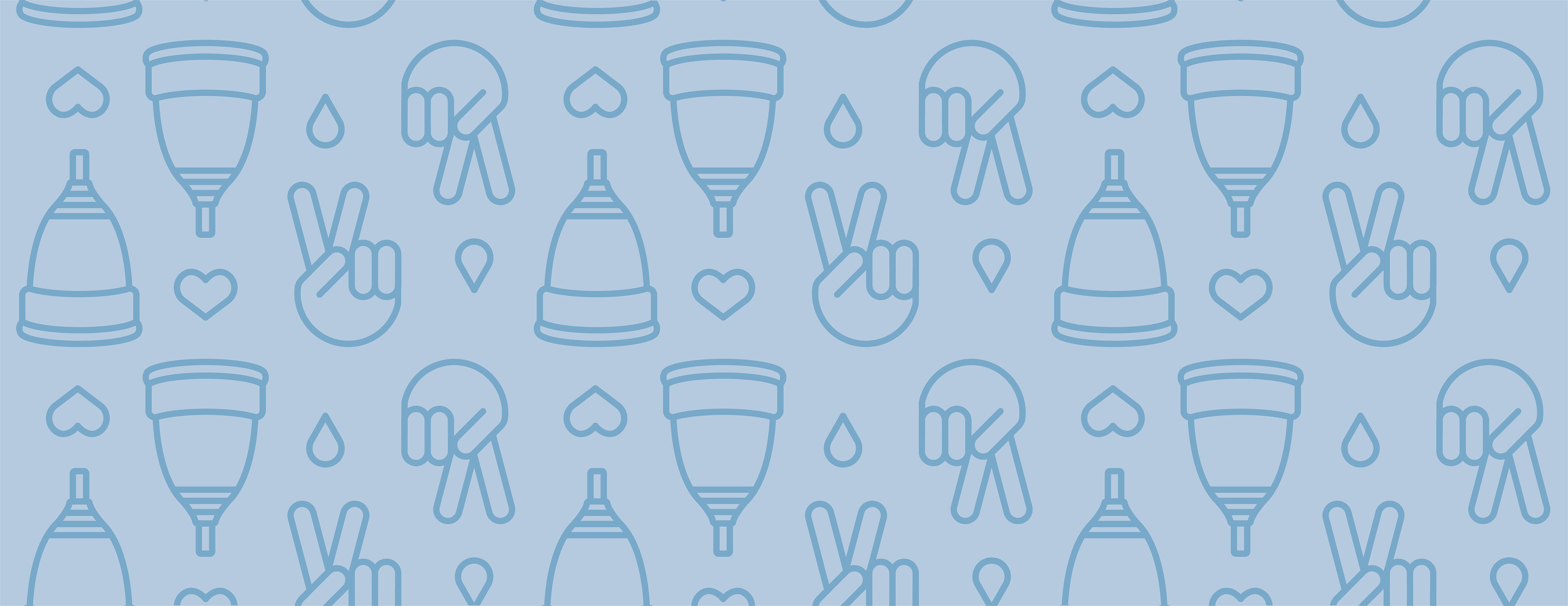
The Diva Cup encourages a more positive period experience, empowering women by offering a sustainable, easy-to-use, cost-effective and eco-friendly alternative to conventional feminine hygiene products. Unfortunately, their current frilly frou-frou packaging doesn't convey any of that. For this identity overhaul, I kept it friendly, feminine, and fun with a fresh logo, color palette, patterns, and of course, packaging.